FARFETCH Design & Brand System
At FARFETCH we defined a cohesive design and brand system with form and function working on an equal footing. Creating a design system that helps improve creativity, productivity & efficiency across the entire customer experience, leading to greater brand awareness.
To accompany this, the design system needed to set the motion principles to work across platforms and help speed up production of both marketing/brand assets and product design, including the mobile app and website.


Logotype
The FARFETCH logotype has been refined, elevated, and modernised to create global coherence across the customer experience. The FUSE is a graphic fusion of two letters, the Fuse takes its direction from the Farfetch logo’s double F
Grids
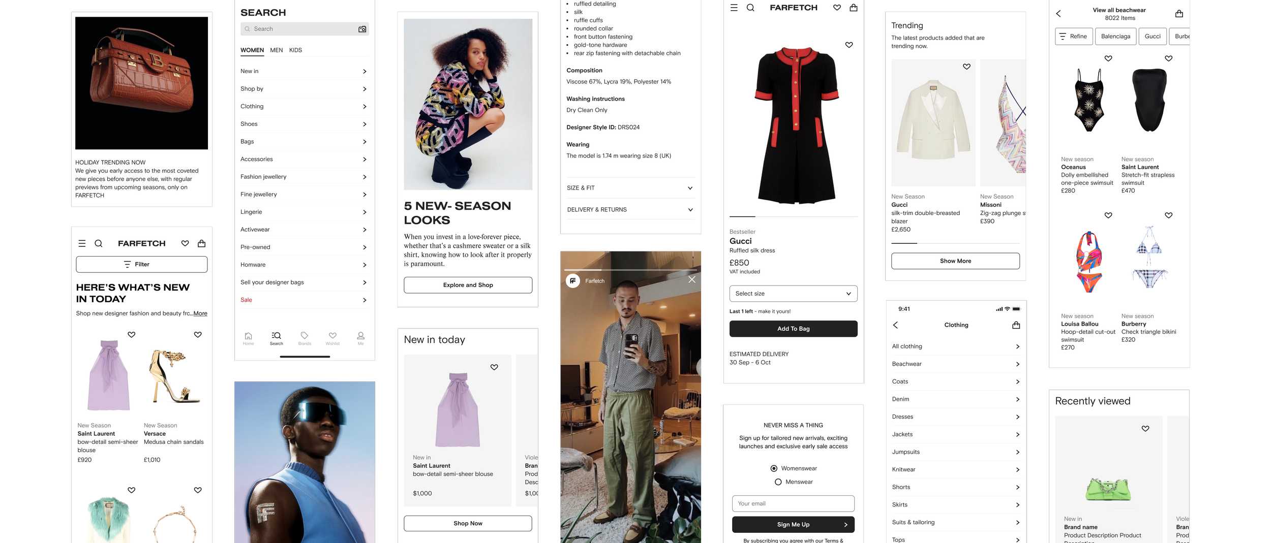
The balance between optimised white space, images and typography is carefully maintained to facilitate a calm and ordered digital environment.


Colour
FARFETCH favours a monochromatic approach to colour that mimics the ordered atmosphere of a curated gallery space. The predominant use of black and white across the interface supports brand recognition throughout the customer journey.


Iconography
Universally understood icons encourage instinctive interactivity and have been created to maximise understanding across multiple languages, regions and audiences.


Typography
Confident layouts with succinct messaging will maximise the impact of our communication.


Layout
Confident layouts with succinct messaging will maximise the impact of our communication.


Components
Function meets elegance with hundreds of interactive building blocks that help to quickly and easily create user interfaces across platforms.

The System In Action


The System In Motion

Principles

Confident
Motion on type and image are at odds with one another. One static and one eased creates a bold design aesthetic.

Considered
Every interaction, no matter the platform, should consider the needs of the audience and the purpose of the touch-point.

Concise
Our motion language holds to the adage, “Less is more.” Just because something can move doesn’t mean it should.
Scale of expression
The brand expression has been split into two categories, Functional and Emotional. This allows a sliding scale of expression that maintains consistency within the overarching motion language while also adhering to the brand tone of voice.

Easing
Functional [A] and Emotional [B] easing is used with imagery, transitions, containers, and logos. They are the most enthusiastic moment in the Motion System and can be used with persistent elements that move from one on-screen position to another. The expression scale has been provided from functional to emotional, ensuring flexibility in uses.

Decelerated
cubic-bezier (0,0,0,1)
Outgoings 88% Incomings 0%
Context
CSS
After Effects
Accelerated
cubic-bezier (1,0,1,1)
Outgoings 88% Incomings 0%
Accelerated

Decelerated

Typography
The FARFETCH typography system has been developed to follow the scale of expression inherent in our motion theory.
Functional: Type animation focused on simplicity


Conversational: An extension of functional that’s more editorial


Expressive: Emotional type animations creating unique and exciting messaging


The Fuse
FARFETCH Monogram, or The Fuse, is a new asset released; the simple, fluid and elegant motion were used to give maximum flexibility in application.


Iconography
Iconography follows the same languages as our motion system. Simple, non-prominent icons such as down-states make use of our functional timings, while key interactions make use of our emotional animations.


Imagery
Using the best practice in the UK, images can either be hard cut or swiped using the established easing values. practice


Solution
A design system that enabled function and expression. Promoting design consistency at pace and scale while allowing designers, creatives, and developers freedom of creative expression. The system is flexible across web, app, and physical touchpoints.
To complement this the motion system enabled function and expression. A set of principles that offer both creative expression and enable easy asset creation with design consistency. A system that can work at pace and scale while at the same time reflect the brand values and ethos.
Role
Experience/Design Strategy and Director
Team
Brand: Ronojoy Dam
Agency: Bureau Borsche
Brand platform: Louise Robertson
Design: James Cuddy
Motion: Chris Meadmore